
Gearing up to redesign your website? Wondering where to start? Looking for advice about the process? This interview is part of a series featuring a variety of approaches that Massachusetts public libraries have used to redesign their websites. In this interview, we’ll learn about the Cushman Library’s website redesign from Karen E. Stinchfield, the Director of the Cushman Library in Bernardston.
What process did you use for your library’s website redesign?
Karen E. Stinchfield: Many years ago, I created our first website using Googles Sites. It was gorgeous, warm and beautiful with the building and the pond, and easy to navigate. After several years, the tabs started bunching up on each other and, reluctantly, I created a new one in New Google Sites that was challenging to put together, not nearly as attractive, and not as functional. About a month into the pandemic, one of our staff members commented that the website wasn’t visible. Turned out I could see it as the creator, but no one else could, during a time when we really needed a functional website. I decided to go with WordPress. I knew what I wanted but I had trouble getting started. I set up a one-on-one tutorial, but it still didn’t get me started. Then, months into the pandemic, my friend Jared Libby, who is a tech wiz who created websites for his band Appalachian Still and his sound company That Sound’s Groovy, came to Cushman and we sat masked for an hour and a half setting up the framework. He helped me find the layout I envisioned, one that would feature our gorgeous photo of the library reflected in the adjacent pond, and then we found the perfect background color, so warm and welcoming. I am not a fan of websites that are mostly white and busy with so many tabs and buttons. They feel like visual assault. I wanted our site to be beautiful and mellow. Once it had the look I wanted, Jared showed me how to edit the pages and menus, and then I was on my own. It very easy to change out the information. For an investment of an hour and a half, we have a beautiful and functional site. Plus, WordPress did the work of switching our hosting from GoDaddy, which was great, to WordPress, which is also great, and having it all in one place is good.
How did you draft the organization of content on your new site?
Karen E. Stinchfield: “Home” is where viewers can find our hours, catalog links, Wowbrary, a brief description, address, and telephone number. Then, under “About” folks can find information about Staff, Volunteers, Board of Trustees, Friends of Cushman Library, and Libraries in the Woods (going from most local to regional). Then there’s the “Programs” tab and down menu, which includes our regular programs and our seasonal offerings. The next tab is “Events,” which includes one-time offerings, like a concert by the pond. Then “Employment,” a tab that is not always visible, depending on the present need. And finally, our “Contact” page. It feels like a natural progression.
How did the principles of user experience influence your redesign?
Karen: I really wanted our website to be beautiful, warm, and welcoming, like our library. I wanted it to be easy to use, informative, not overwhelming, and not a visual assault. People often tell me that they love our website. This makes me happy.
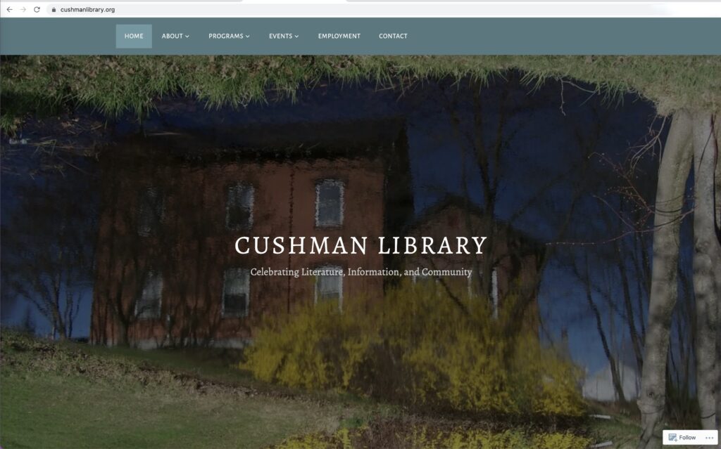
How did you approach branding and aesthetics?
We have an image of the library reflected in the adjacent pond that was taken several years ago. It is just beautiful! This image appears at the top of each page within the website. It is a positive image. We often use this image as the cover photo on our Facebook page, so it has become recognizable to our patrons. It also sets a tone for the website that is warm.
How will you update the site and make sure it continues to be accessible and user-friendly?
I keep the site updated with accurate information and the latest programming and events. Once the site was set up in WordPress, updating is easy and I can pop in and tweak it as necessary. After any changes, I always look at it as visitors would see it, to make sure it looks the way I want it to and it’s easy to maneuver within.
What advice would you give to a library getting ready for a website redesign?
I would recommend that you decide, prior to any work on the site, how you want your site to make visitors feel. Have an idea of what type of layout will work best with the information you plan to share and then seek out a layout that meets those goals. Plus, going with a website service that allows you to make changes yourself once the site is set up means you won’t be dependent on someone else doing it.
Any final thoughts?
I procrastinated for a long time. It came to my attention that our New Google Site was not visible to others about a week into the initial pandemic closure. I was flat out busy reinventing just about everything we were doing, so I felt like I didn’t have the time or the brain space to devote to creating a new site, but it needled at me for months, because it needed doing. Our Facebook page was functioning as a full-on virtual library, but we still needed an up-to-date website. When I finally just sat down with my friend and got the basics down, it took an hour and a half, and then I was so happy to have started the process that I immediately loaded the site with information and images. It was empowering, and it reminded me of a lesson that often surfaces, that it’s easier to just do it than to procrastinate and worry about doing it.
Interview with Karen E. Stinchfield, Director, Cushman Library, Bernardston
Interviewed by Michelle Eberle, Consultant, Massachusetts Library System

